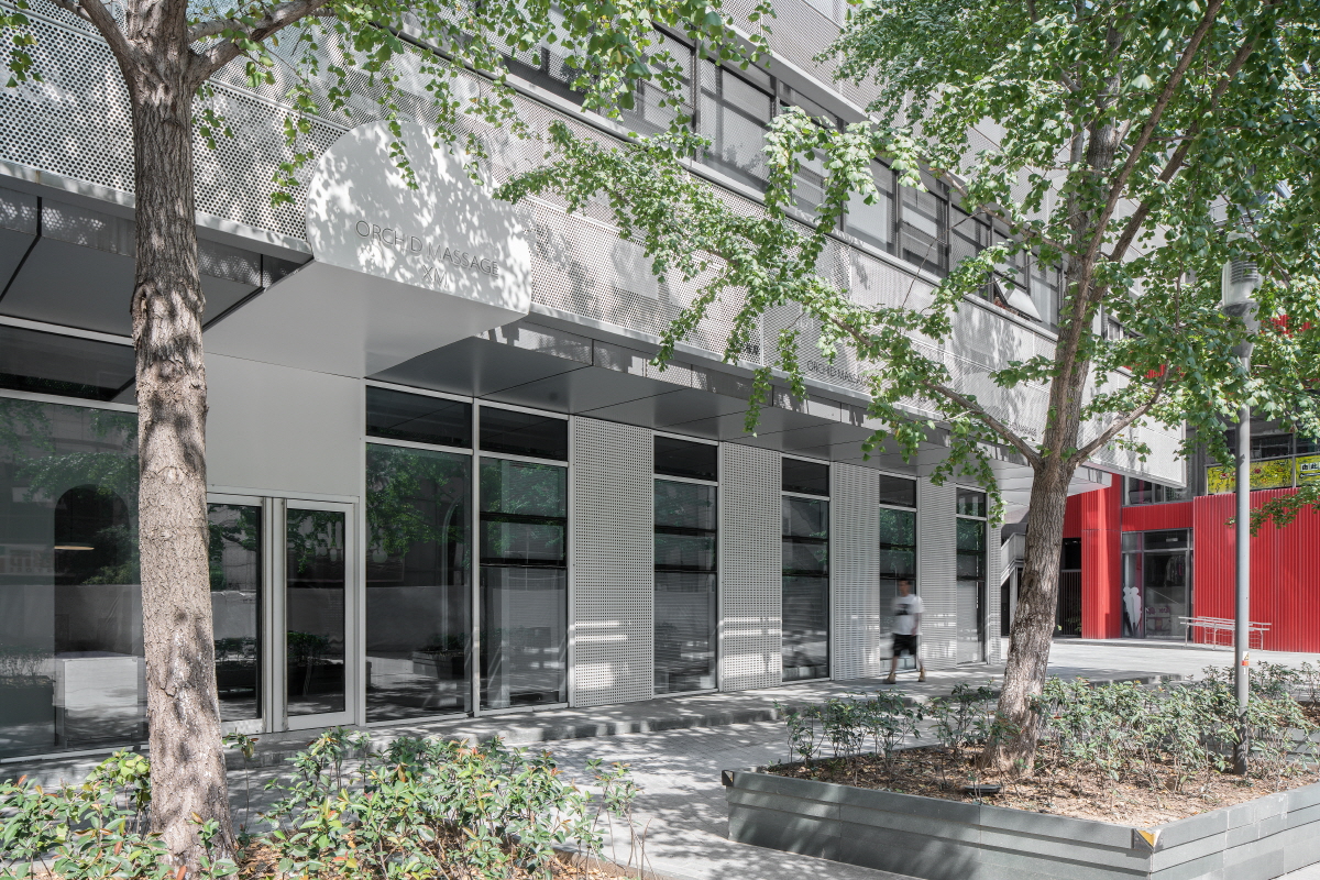
“Era” that’s the first word that comes to mind before we do this project. If the previous case of ORCHID SPA was to explore new qualities and fields, then as the second project we designed that it must be more pioneering and innovative, so “Era” is a new start.
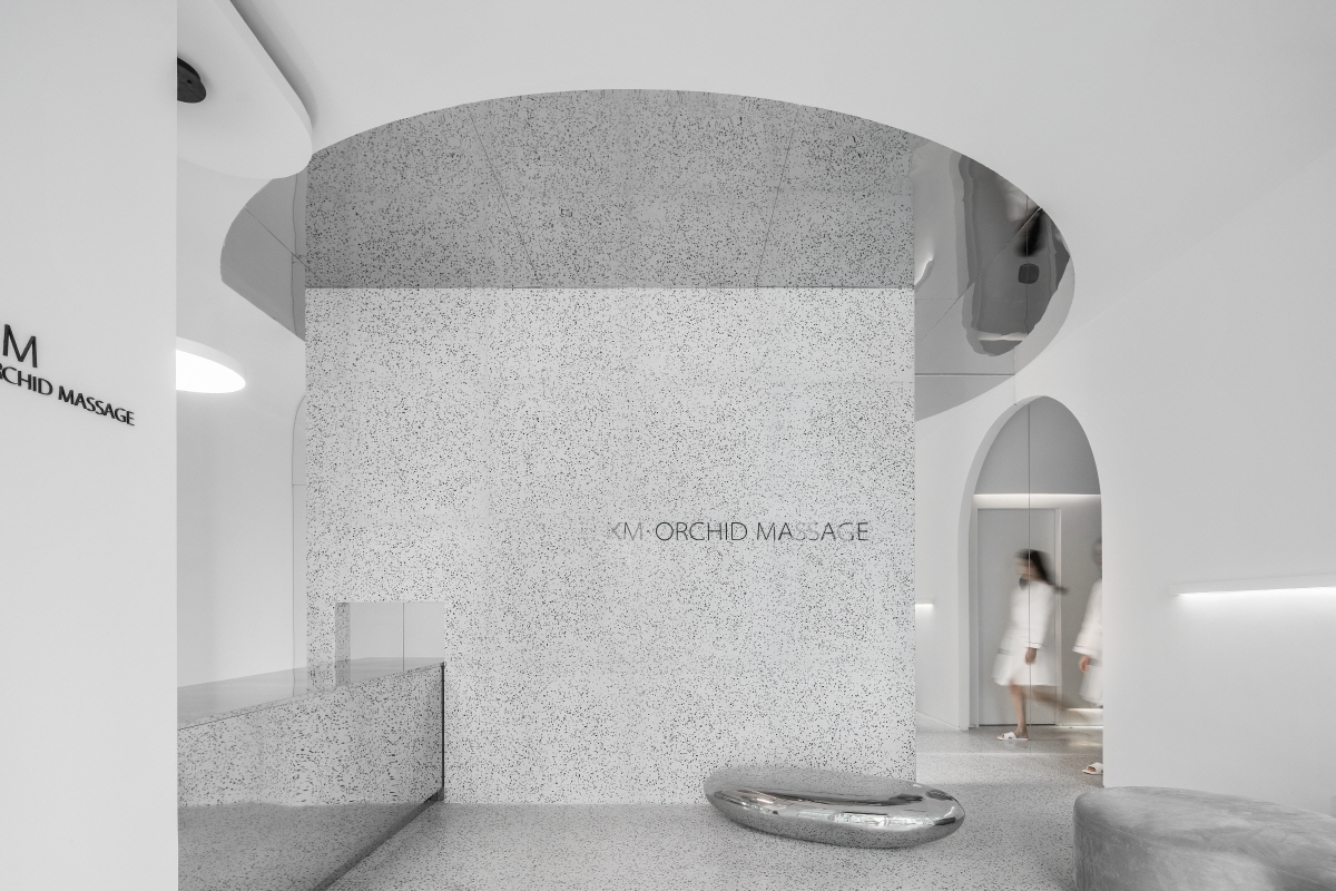
The traditional oil massage space is mostly dark and mysterious, but people often ignore that the core problem of this type of space should be “clean”. A clean and comfortable space is very important for users of the experience. Based on such basic needs, we want to create a clean, comfortable and pure space. “A picture reflected by a mirror opened up a new Era. Developed a piece of pure land in the complex world for who come here for massages eliminate fatigue and relax their bodies.” That’s what we expect when we design this space.
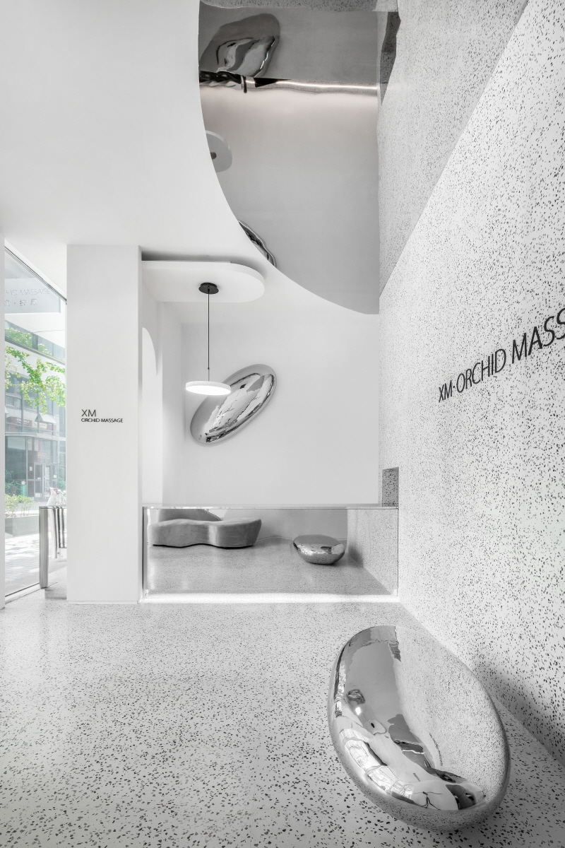
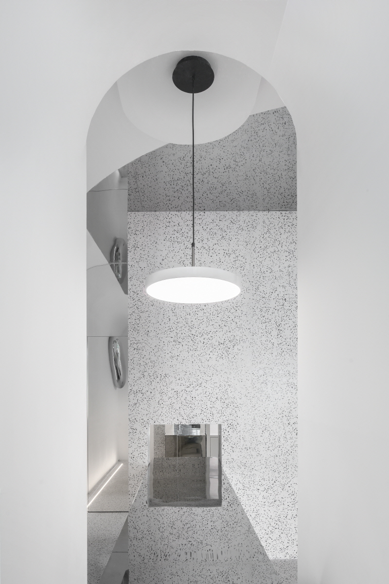
In terms of space experience, we are no longer satisfied with the traditional arc and arch. But through scale adjustment, let it produce new change, like going from 2d vision to 3d space. Dimension is a word that transcends spatial category. This is a very clever design of putting mirrors on the walls of the narrow corridor and allowing the space of the semi-arch corridor to extend to the entire wall to present a complete visual archway. And the top of the semicircular mirror stainless steel, so that the unreal mirror space once again expanded the dimensions. So a half – arched corridor space extends out into three mirror Spaces. There is truth in the virtual and vice versa such as .
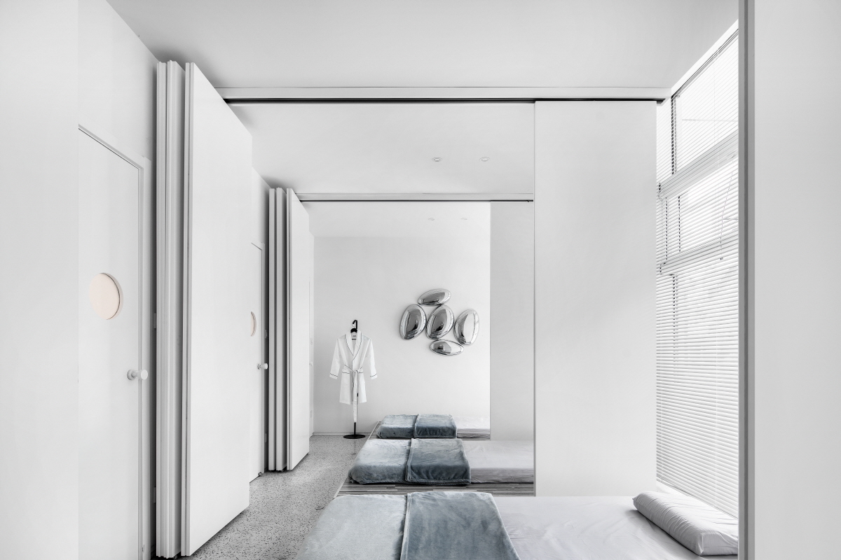
The effect of expanding the dimensions of space through the mirror stainless steel is like ripples produced when a dragonfly touches the water. Just as Song Yanyu said in :” The beauty of them is that they are so penetrating and exquisite that they are difficult to grasp directly, just like the sounds in the air, the colors of their appearance, the moon in the water, the image in the mirror, and no amount of gorgeous language can be described.”
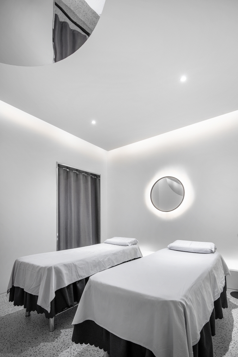
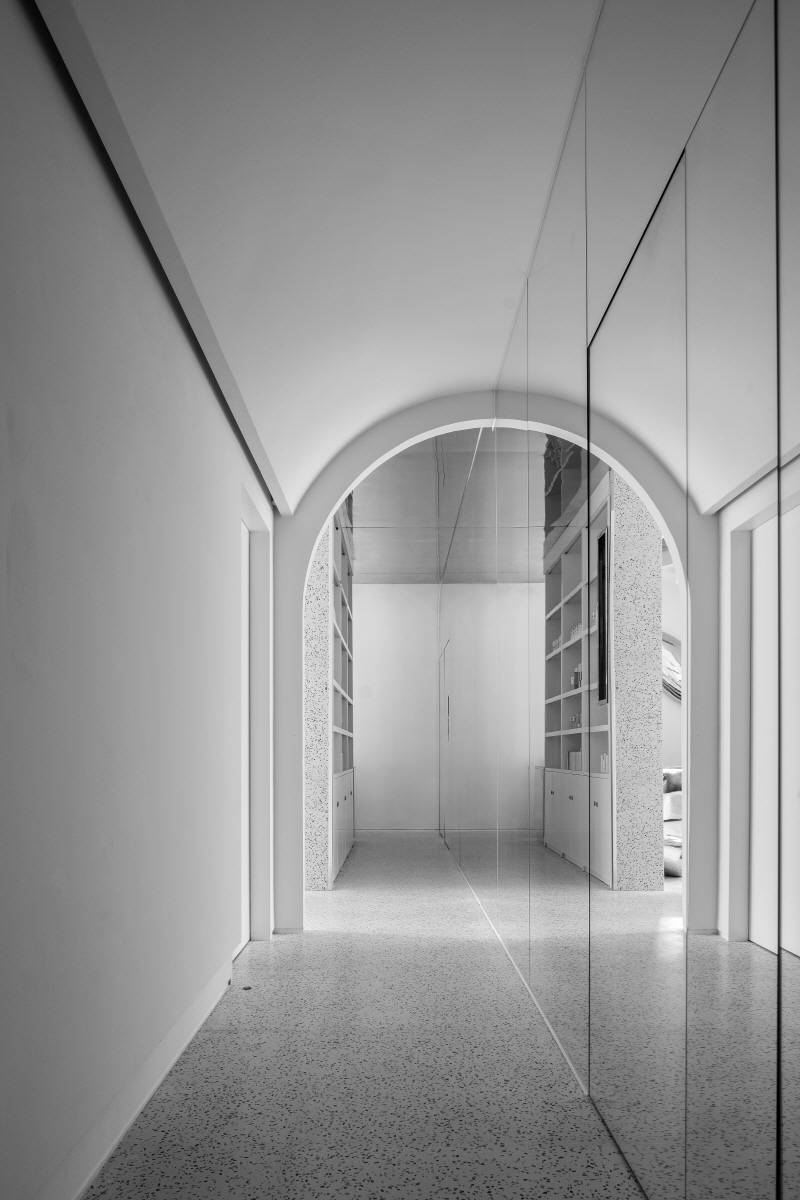
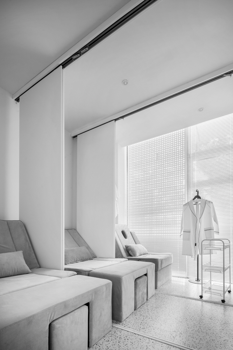
The design of the functional space reflects the concept of “interweave and separate”. The accommodating, classic office area is interspersed with the display space, with the walls featuring a variety of textures and forms to allow designers to choose from a range of different shooting backgrounds. The multifunctional workstations have been built to arrange cables and storage items to fit the design brief of seamless integration/separation and ensure that the area is kept tidy and productive. Simultaneously, the interior of the arc wall is specifically designed to provide more storage space for current and future stock, maximising space efficiency.







0개의 댓글
댓글 정렬